
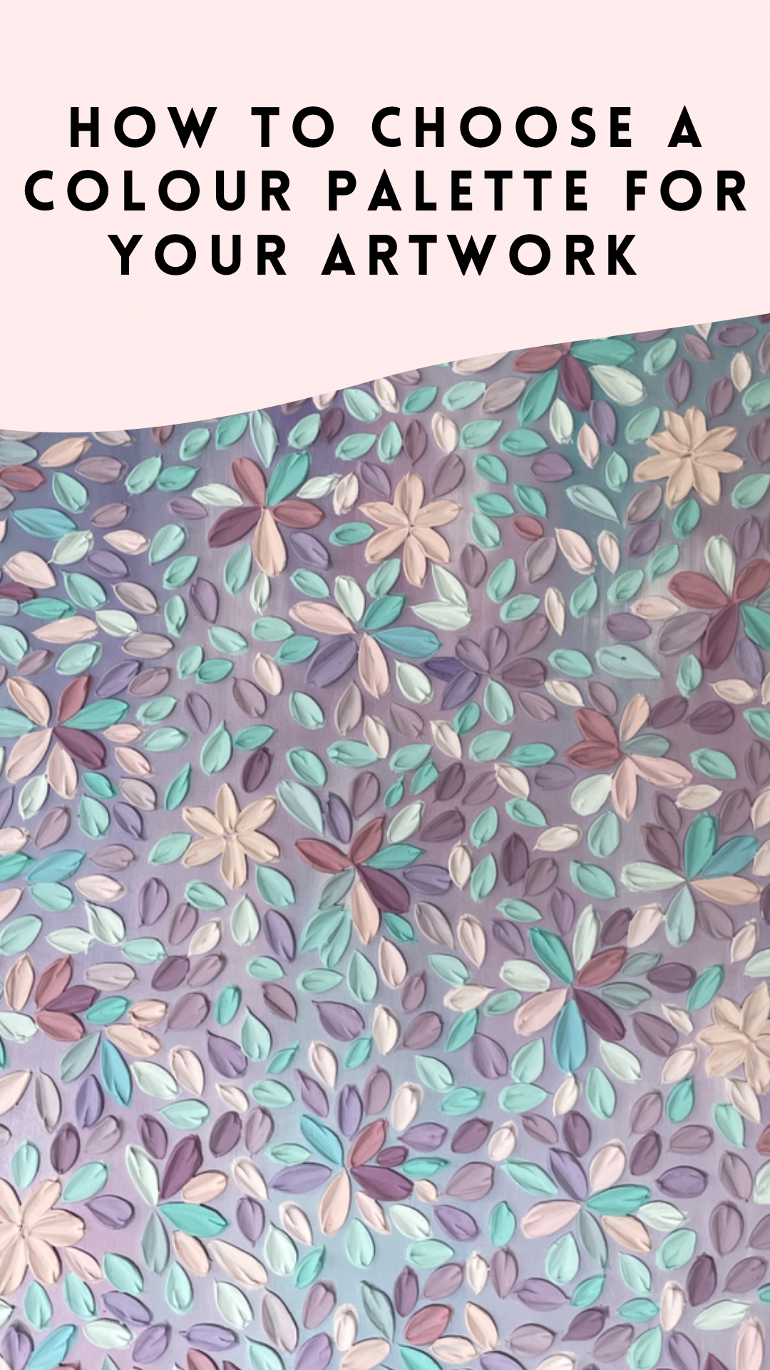
How to choose a colour palette for your artwork!
Choosing the right colour palette is an essential part of creating a beautiful cohesive artwork. A well-selected colour palette can evoke emotion, communicate a message, and enhance the overall impact of your piece.
Here I have compiled 6 key factors to consider when choosing a colour palette for your artwork.
1. Consider the purpose and message of the artwork
Different colours have different associations and can evoke different emotions. For example, red is often associated with passion, energy, and danger, while blue is associated with calmness, trust, and stability. By understanding the message that you want to convey through your artwork, you can choose colours that will support, compliment and enhance that message.
2. Look for inspiration
Inspiration can come from a whole variety of sources, just look at the world around you! Nature, fashion, interiors.. Look for colour combinations that you find particularly appealing and try to understand why they work. Keep a collection of colour swatches, photos, or other inspirations that you can refer to when creating your own colour palettes. Use things you are naturally drawn to and most importantly follow your heart.
3. Use a colour wheel
A colour wheel is a visual tool that can help you choose colours that work well together. It is a circle that shows the relationship between primary, secondary, and tertiary colours. Colours that are opposite each other on the colour wheel are called complementary colours and can create a strong visual impact. Colours that are next to each other on the colour wheel are called analogous colours and can create a harmonious colour scheme. Using a colour wheel guide can also be particularly helpful when mixing up your own colours.
4. Limit the number of colours you are using
Sometimes using too many colours can create a chaotic and overwhelming effect. A good rule of thumb is to use no more than five colours in your artwork. By limiting the number of colours, you can create a more cohesive and balanced composition.
5. Consider colour temperature and where the artwork will be placed
Colour temperature refers to the perceived warmth or coolness of a colour. Warm colours, such as red, orange, and yellow, can create a sense of energy and excitement, while cool colours, such as blue, green, and purple, can create a sense of calmness and relaxation. By understanding the temperature of different colors, you can create a mood or atmosphere in your artwork.
Also have a think about where the artwork might be placed. In a soft dreamy bedroom? A bright colourful playroom? A neutral minimalist lounge area? Different spaces require different looks so it’s important to choose colours that compliment the intended hanging space and existing decor when possible.
6. Experiment and test!
Once you have chosen a potential colour palette you may want to try it out elsewhere before starting your artwork. You can do this by creating small colour studies or swatches on paper to see how the colours work together before committing to them on canvas. You can also use digital tools to create mockups of your artwork with different colour palettes. By testing out different options, you can refine your colour palette and make it even more magical!
Most importantly Have fun!!